This Big Island kitchen renovation proves you don’t need deep pockets to spice up the heart of your home on many levels—functionally, aesthetically, and with an eye to the environment!
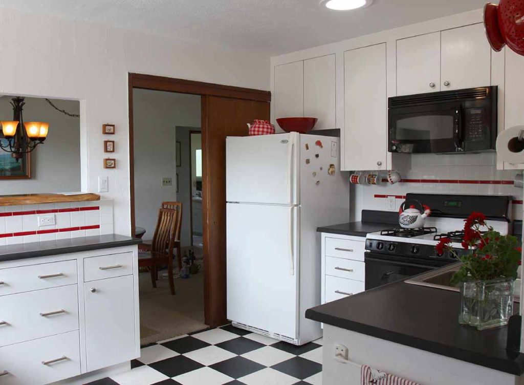
Careful removal and addition of key kitchen elements resulted in a “green” kitchen with a crisp black and white color scheme, and red accents.
Costs were kept in check by:
- Retaining existing cabinetry , range and refrigerator.
- Presenting the homeowners with a workflow list so they could manage their own project (after the designers met with the plumber, cabinet maker and electrician to confirm their scope of work).
- Painting and demolition handled by the homeowners.
- Exchange or barter of design fees for dog walking services!

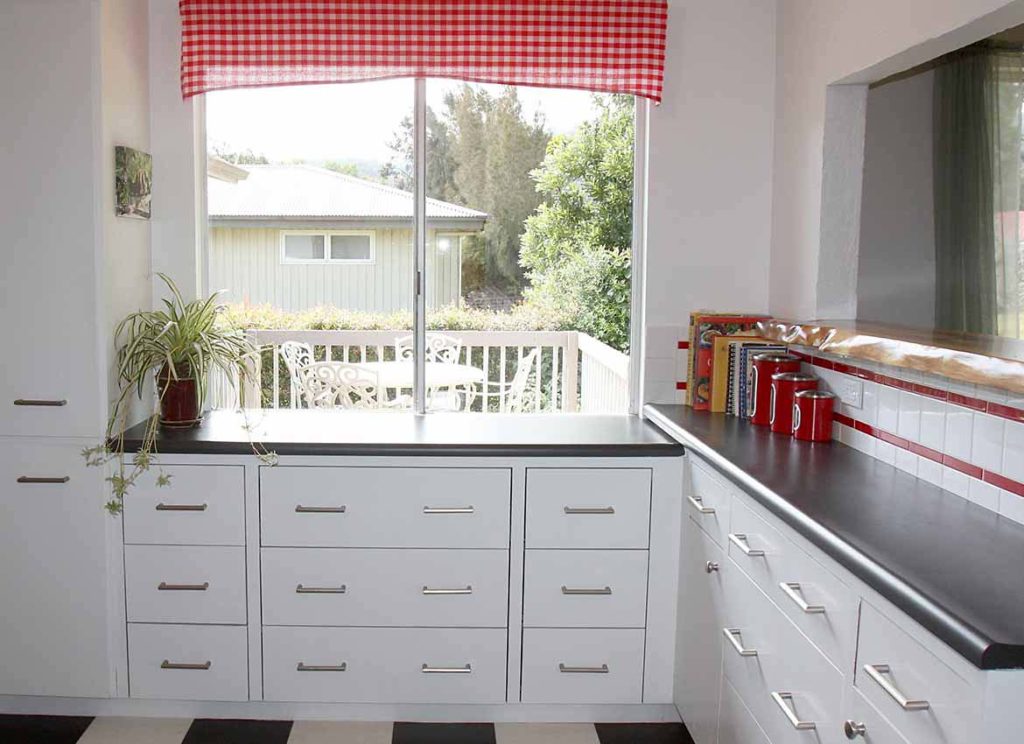
Newly painted cabinetry with a laminate worktop under the pass-through provides good value and adds much needed storage. The black and white flooring is vinyl composition tile. Ceramic tile is used only at backsplashes, adding inexpensive red and white accents.

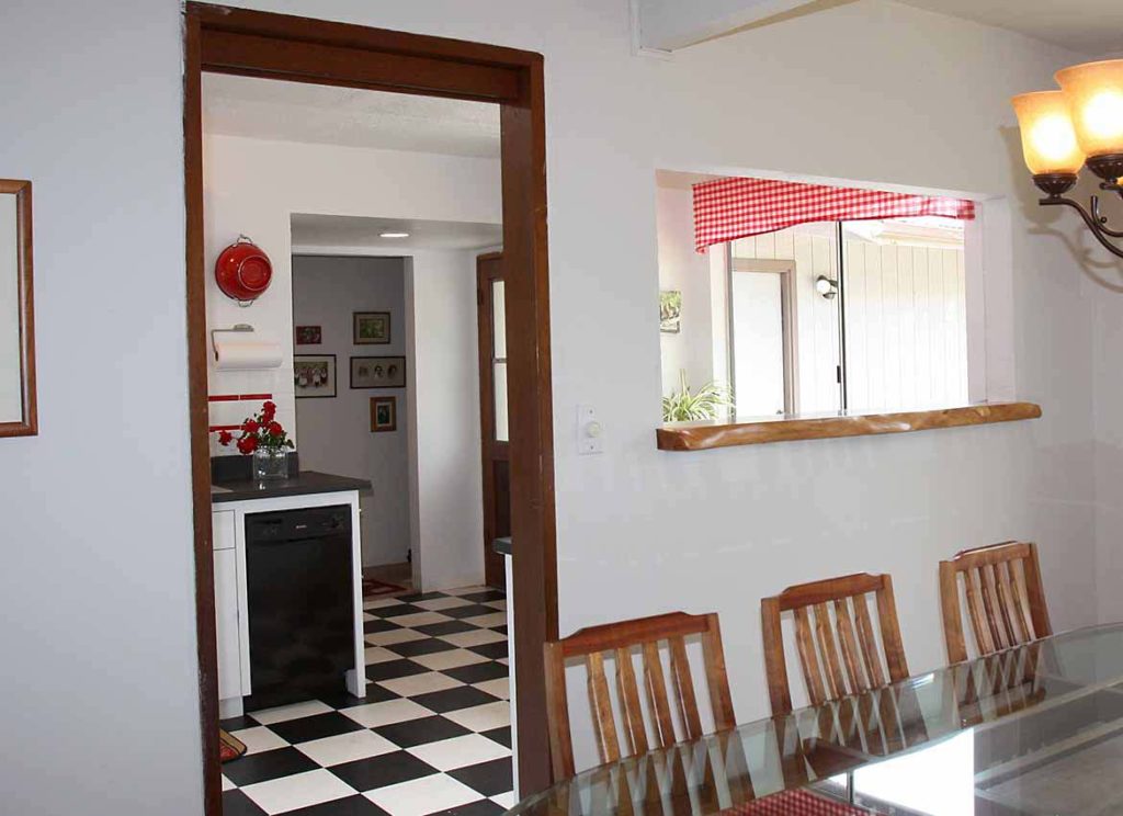
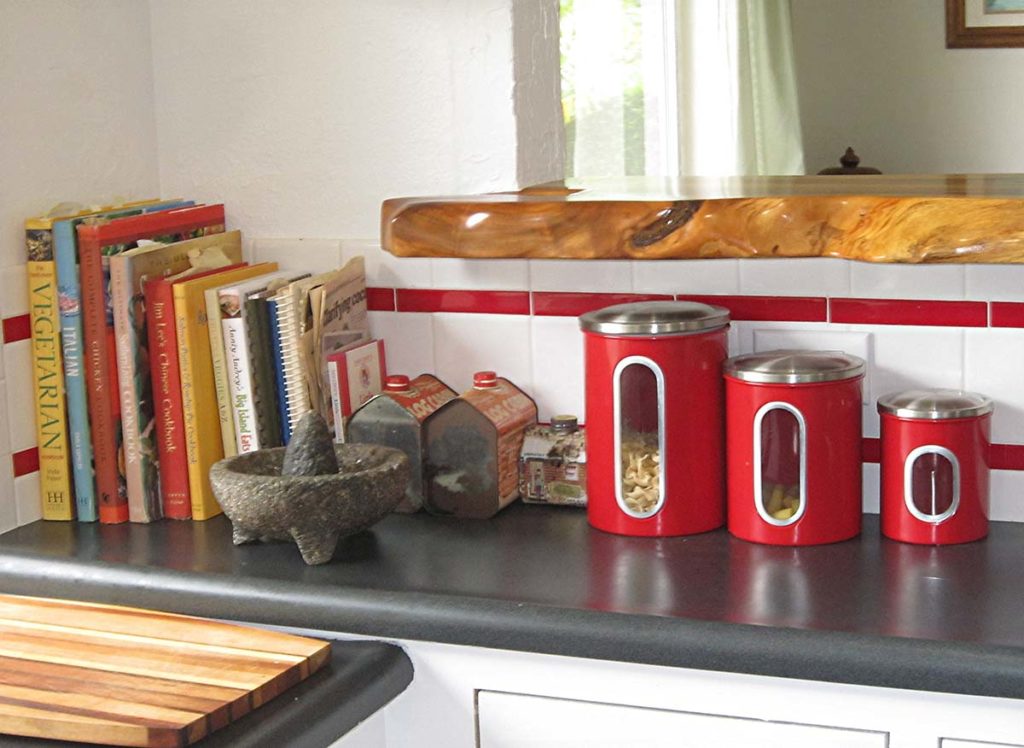
A custom wood countertop was added to the enlarged pass-through, to tie it in with the koa dining table. Doors and framed openings are also wood. The flooring is carried throughout the entry and kitchen, visually expanding the space.

Natural light from the existing window was enhanced with the addition of a Solatube to bring in additional light. Window treatment was kept to a minimum for the same reason, while complementing the color scheme.

Laminate countertops with their user-friendly post-formed edges were a very durable and cost effective choice.
Please contact us if you're interested in discussing some options for your kitchen renovation!
Published by: Susan J. Moss, ASID, LEED Accredited Professional in Active Blog, Residential Design, Sustainable Design
Tags: renovation, painted cabinetry, flooring, Sustainable, trends, interior design, residential, kitchens, Interior design in Hawaii, Sustainable Design, Trans-Pacific Design

Clem Lam
September 13, 2016 at 3:45 pm
Nice project and nice marketing tool
Comments are closed.
Sue Moss
September 13, 2016 at 5:57 pm
Thanks Clem!!
Comments are closed.
wmcwmson
September 13, 2016 at 4:25 pm
Sue, I think maybe a copy ‘white’ vct into the cabinet white and maybe a very light creamy gray for the dominate. Just an observation to make the space look larger, yet still lite. A gray for the walls would be a combination of black accent and white dominate.. Great site format. !!!
Comments are closed.
Sue
December 6, 2016 at 2:49 pm
Hi Bill the colorist!!!
Thank you for your comments, in this case, we have to consider the client’s wishes and it was to be black & white with red accents….the grey might have muted the punch of this stark combination anyway!
Comments are closed.